Radio and Checkbox fields let users select options in a form. Radio buttons are used when users should pick only one option from a list (e.g., Yes/No, Male/Female), while Checkboxes allow selecting multiple options at once (e.g., selecting multiple services or interests).
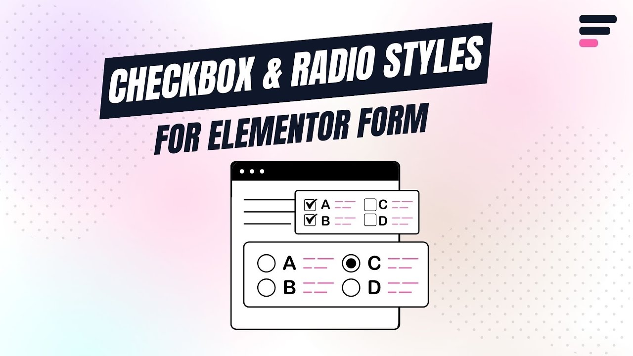
What are Radio & Checkbox Fields?
Imagine you’re building an online survey form, a radio field asking: “How did you hear about us?” with options like “Google,” “Social Media,” or “Friend.” While a checkbox field could follow up with: “Which services are you interested in?” with multiple checkable options like “Web Design,” “SEO,” and “Hosting.”
Follow these simple steps to add Radio & Checkbox Field to Elementor forms:
Add Radio & Checkbox Inputs
* Firstly, make sure you have “Turned on“ the Radio & Checkbox Styler feature in the WordPress Admin Panel >> Elementor >> Cool FormKit >> Form Elements Tab.
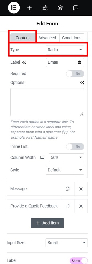
- Navigate to the Content section of your Form Field. From the Field Type dropdown, select Radio & Checkbox Fields.
Customization
Once you’ve selected the Radio & Checkbox Fields, you can customize its appearance using the following options:
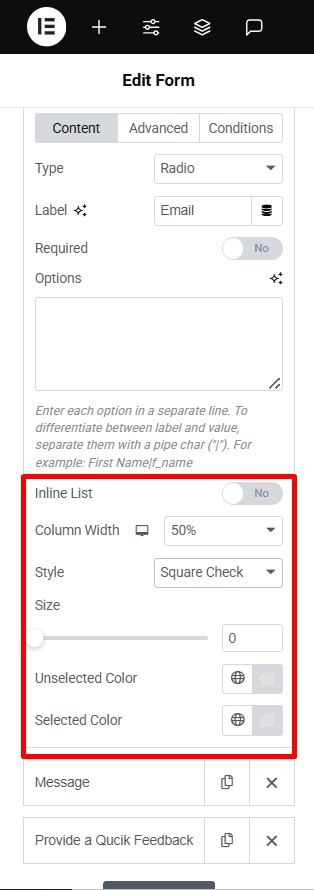
- Choose a preferred style option from the style dropdown.
- The following style controls will appear:
- Size: Adjust the size of the radio & checkbox icon.
- Unselected Color: Select the color that will display on the radio & checkbox icon as default unselected option.
- Selected Color: Select the color that will display on the radio & checkbox icon as the selected option.